AI and diagrams
LLMs are bad at drawing diagrams. Or are they?
I compared image generation, Mermaid and Excalidraw, then separated the diagram's meaning from its layout.
I tend to use LLMs for coding, technical documentation and talking about system architecture. For the most part they are good at explaining how something works, describing components and dependencies, and pointing out things I haven't considered.
Asking the same model to draw the architecture is more challenging, however.
The first response looks good, but you soon start seeing the details that are wrong. An arrow pointing at the incorrect service, overlapping labels, a database that appears twice for no reason. You ask the model to fix one arrow and somehow it moves three other components. At times it even reverts the change it was supposed to fix in the previous prompt.
This can get extremely frustrating, and I had to ask myself if it was really the model's fault or if my expectations were too high. I decided to experiment a little and try different approaches: image generation, Mermaid, Excalidraw JSON and a text-based description without any layout information.
The system I used
I didn't want to test it with a simple architecture consisting of three boxes connected together. That would probably work with almost any approach. I created a small application with a few more relationships.
The user interacts with a web application, which calls an API. The API uses Postgres and Redis, and sends long-running tasks to a queue. A background worker processes these tasks and communicates with an external billing service. Failed tasks are returned to the queue and retried, up to three attempts. Successful events are loaded into a data warehouse which is also used by an internal dashboard.
Not particularly interesting, but enough to create some complex relationships in the layout.
The prompt I used was:
Create an architecture diagram for the system below.
A user accesses a web application. The frontend calls an API. The API uses Postgres as its main database and Redis for caching. Long-running tasks are sent to a queue and processed by a background worker. The worker calls an external billing API. Failed tasks return to the queue and are retried up to three times. Successful events are loaded into a data warehouse. An internal dashboard reads analytics from the warehouse.
Group application components, data stores and external systems separately. Label important connections and make the diagram easy to edit later.
I kept the same description for each approach and only changed the instruction for the output format.
Trying to generate an image
I decided to start with image generation because it is the most straightforward approach. Describe what I need and get an image.
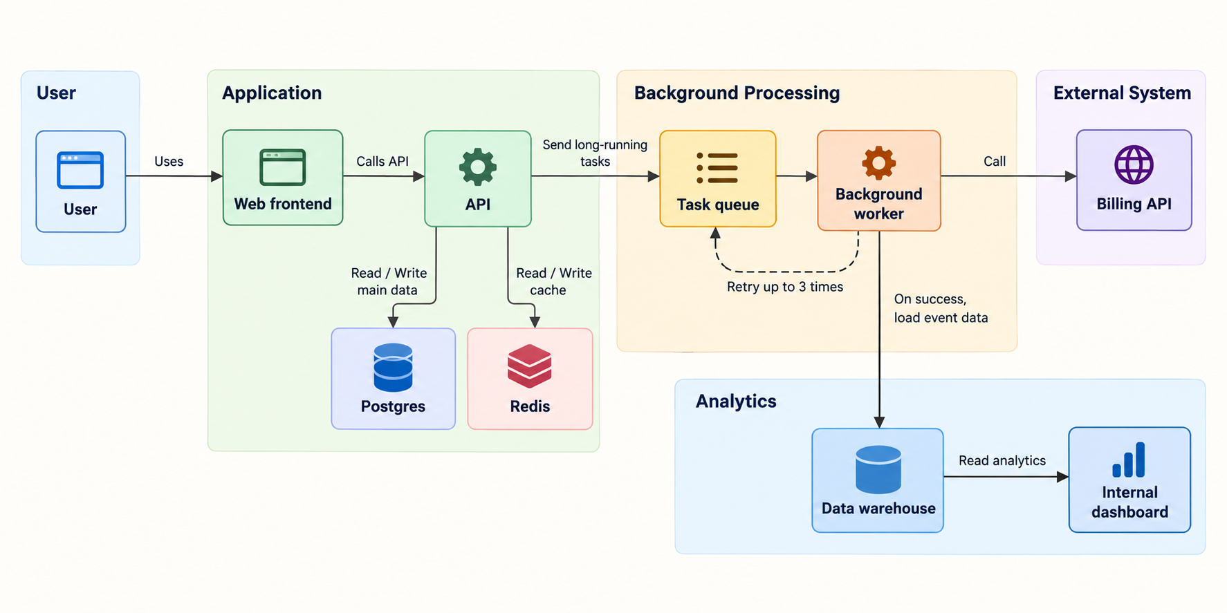
Visually the result was good. Boxes, arrows, databases, colors. It looked like an architecture diagram. The labels were readable as well, which was better than I expected.
The problem is that an architecture diagram is not just a picture.
The model duplicated User as both a group and a node. More importantly, it ignored the grouping I had asked for. Postgres and Redis appeared inside Application, while the queue and worker were moved into a new Background Processing group. None of this made the image unusable, but it showed how a diagram can look correct before you check what it actually says.
What concerned me more was whether I could edit it. Let's say I want to move one component or change the direction of an arrow. For an image model, I'm asking it to redraw the diagram. Maybe the initial issue gets fixed, but something else could change at the same time. It's hard to tell what will stay exactly the same between two versions.
For a presentation, where I only need to show the general idea, this is probably acceptable. For technical documentation that people will use to understand the real system, I'm not so sure. I'd rather be able to fix one thing without having to recheck the entire diagram.
Trying with Mermaid
Mermaid was a significantly better experience. Instead of asking the model to draw boxes in specific positions, I ask it to describe the graph and Mermaid takes care of the rendering.
It is also convenient to keep the definition in Markdown documentation, close to the code and the READMEs.
Mermaid documentationThe generated definition was very similar to this:
flowchart LR
    user[User]

    subgraph application[Application]
        frontend[Web frontend]
        api[API]
        queue[Task queue]
        worker[Background worker]
        dashboard[Internal dashboard]
    end

    subgraph data[Data stores]
        postgres[(Postgres)]
        redis[(Redis)]
        warehouse[(Data warehouse)]
    end

    subgraph external[External systems]
        billing[Billing API]
    end

    user --> frontend
    frontend -->|HTTP requests| api
    api -->|Read and write| postgres
    api -->|Cache| redis
    api -->|Long-running tasks| queue
    queue --> worker
    worker -->|Billing requests| billing
    worker -->|Failed: retry up to 3 times| queue
    worker -->|Successful events| warehouse
    dashboard -->|Analytics queries| warehouse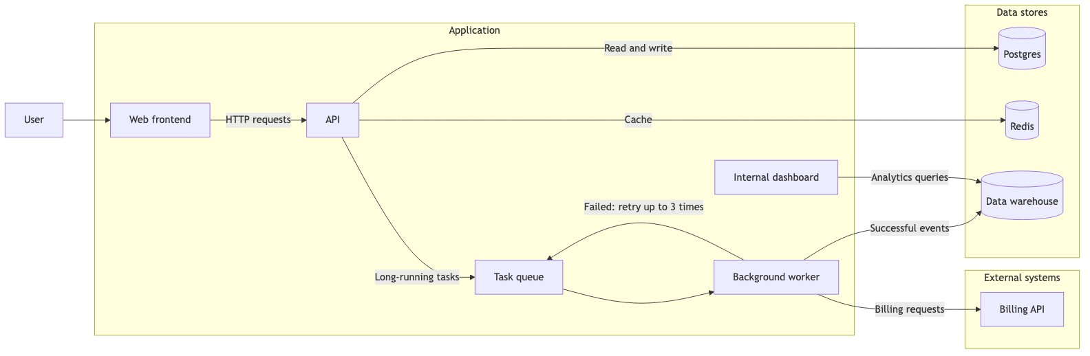
This is much closer to what I want an LLM to produce. The relationships are easy to understand from the source itself. I don't need to inspect the rendered image to understand what the worker does:
worker -->|Billing requests| billing
worker -->|Failed: retry up to 3 times| queue
worker -->|Successful events| warehouse
If the retry arrow is missing, I add one line. If the worker should communicate with another service, I change one definition. Much more convenient.
Of course, Mermaid has another issue: layout. The renderer decides where to put the nodes. It normally does a good job, especially with small diagrams. When you have subgraphs, multiple connections and arrows that go back to previous components, things can get messy.
Even here, the worker sends failed tasks back to the queue, creating a connection in the opposite direction of the main flow. Add a few more relationships like this and you can end up with a diagram that is technically correct but not very nice to read.
You can change LR to TB, reorder the node definitions or add invisible connections to influence the layout. I've done this kind of thing and, once you reach a certain point, it feels a bit strange. I'm not changing the architecture. I'm convincing the layout engine not to put some boxes next to each other.
Nevertheless, for documentation, Mermaid is a great option. The output is small, readable and easy to maintain. And the LLM doesn't have to think about coordinates, which already removes a large part of the problem.
What about Excalidraw?
Personally, I like Excalidraw diagrams. They are less formal, and for explaining architecture to another engineer, sometimes that's exactly what I want. I can move components around, add comments, change arrows and tweak things by hand.
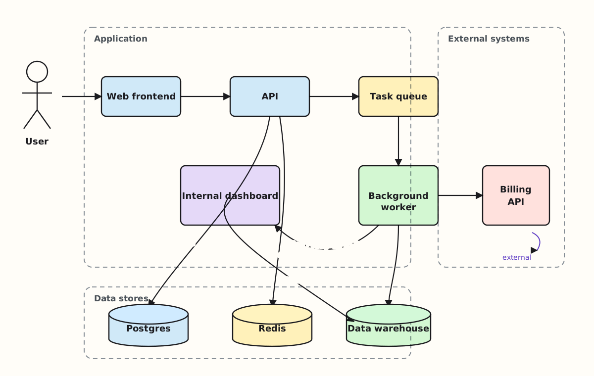
Excalidraw stores scenes as JSON. At first this sounds great. LLMs are comfortable generating JSON, and JSON gives you structured output. The structure isn't the issue. It's the amount of detail.
Excalidraw JSON schema{
"id": "api-box",
"type": "rectangle",
"x": 420,
"y": 180,
"width": 180,
"height": 80,
"strokeColor": "#1e1e1e",
"backgroundColor": "#a5d8ff",
"fillStyle": "solid",
"strokeWidth": 2,
"roughness": 1
}And this is a simplified rectangle. Now add its text, bindings and arrows. Manage the IDs, positions and dimensions, and make sure nothing overlaps. Repeat the same for every component.
We tested this directly while working on diagrams in Amendary. The generated scenes parsed as JSON and, surprisingly, the three samples did not contain overlapping boxes or dangling bindings. But every generated element was missing fields the editor normally owns, such as its seed and version. The model was also choosing every coordinate, which meant the layout was neither easy to validate nor reproducible.
Rendering introduced another problem. Excalidraw's renderer expects browser geometry APIs. Our server-side attempts either failed or produced invalid text positions. We could run a headless browser, but that is a lot of machinery just to turn model-generated coordinates back into a picture.
Excalidraw also has a Mermaid-to-Excalidraw converter. That is a better route when a person wants to start with Mermaid and then adjust editable elements in the browser. It still leaves the server-side generation and validation problem for us.
Excalidraw Mermaid converterMaybe I'm asking for the wrong output
After looking at these approaches I started thinking that the biggest issue wasn't understanding the architecture. The components and relationships were already described in the prompt. What changed was how much extra work I asked the model to do.
Mermaid mostly describes the connections. Excalidraw JSON also needs the layout and the editor's internal representation. Image generation produces the visual directly, but makes the structure harder to inspect and edit.
Why should the LLM decide where each box goes in the first place? What I actually need from it is a structured description of the diagram. The layout can be handled by normal code.
{
  "title": "Application architecture",
  "kind": "topology",
  "groups": [
    {"id": "application", "label": "Application"},
    {"id": "data", "label": "Data stores"},
    {"id": "external", "label": "External systems"}
  ],
  "nodes": [
    {"id": "api", "label": "API", "kind": "component", "group": "application"},
    {"id": "postgres", "label": "Postgres", "kind": "datastore", "group": "data"}
  ],
  "edges": [
    {"source": "api", "target": "postgres", "label": "Read and write"}
  ]
}
There are no coordinates, font sizes or arrow paths here. Just the components, types, groups and connections. It is also much easier to validate: all referenced nodes must exist, labels have limits, and a topology cannot suddenly contain an unsupported shape.
What we implemented in Amendary
This is the approach we eventually implemented for diagrams in Amendary. The model does not produce Mermaid or raw Excalidraw JSON. It returns a graph in a fixed schema: nodes, edges, groups and labels.
Code validates the graph before drawing anything. IDs must resolve, duplicate labels are rejected, and each diagram kind has limits on its nodes and edges. Every visible label must also appear in the page or code the model was given. If a label is not grounded, the model gets one retry naming the problem.
After that, Graphviz calculates the layout and renders SVG and PNG. We use the same coordinates to build an editable Excalidraw scene. Given the same graph and Graphviz version, the output is the same. The model never decides a coordinate, color or arrow path.
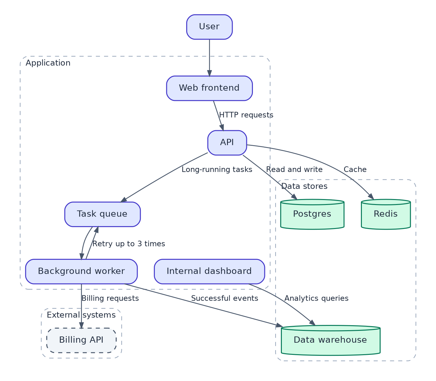
The distinction is important. Grounding can prove that Postgres, Redis and a label such as Read and write appeared in the evidence. It cannot prove that an arrow points in the correct direction. A model can connect two real components incorrectly. The reviewer still has to judge the relationships, and diagrams therefore wait for review rather than being applied automatically.
This did not make the LLM perfect at diagrams. It reduced the part of the problem we ask it to solve. The model decides what belongs in the picture. Code owns the invariants, layout, rendering and files.
So, are LLMs bad at diagrams?
It depends on what I ask them to do.
If I ask an LLM to behave like a drawing application, I will probably have problems. Generating pixels, calculating coordinates and keeping arrows attached while editing a large diagram is not where I find it most useful.
I would rather ask it to identify the components, groups and relationships. I can validate that description before producing anything visual. Normal code can then handle the layout, and I can make the final adjustments myself.
For a simple diagram, Mermaid is probably enough. I don't need a rendering pipeline to connect three boxes. For something larger that will be generated or updated regularly, I would keep the architecture definition separate from its layout.
In the end, I don't really want the LLM to draw my diagram.
I want it to help me describe the system correctly, so I can spend my time checking the architecture instead of worrying about arrows.